If you are not a graphic designer, you may not be aware that the brand identity for the Olympics Games are a designer’s…well, Olympics. Honestly, receiving the contract to create the look of the games would be both an absolute dream and a total nightmare. It’s a project that any designer would love to be a part of, yet also terrifying to have your work on the world stage with every flaw visible.
Holding a particularly coveted spot among the design community are the pictograms of each Olympics. We love to either revel in their simple genius, or admonish them for their complex, over-design.
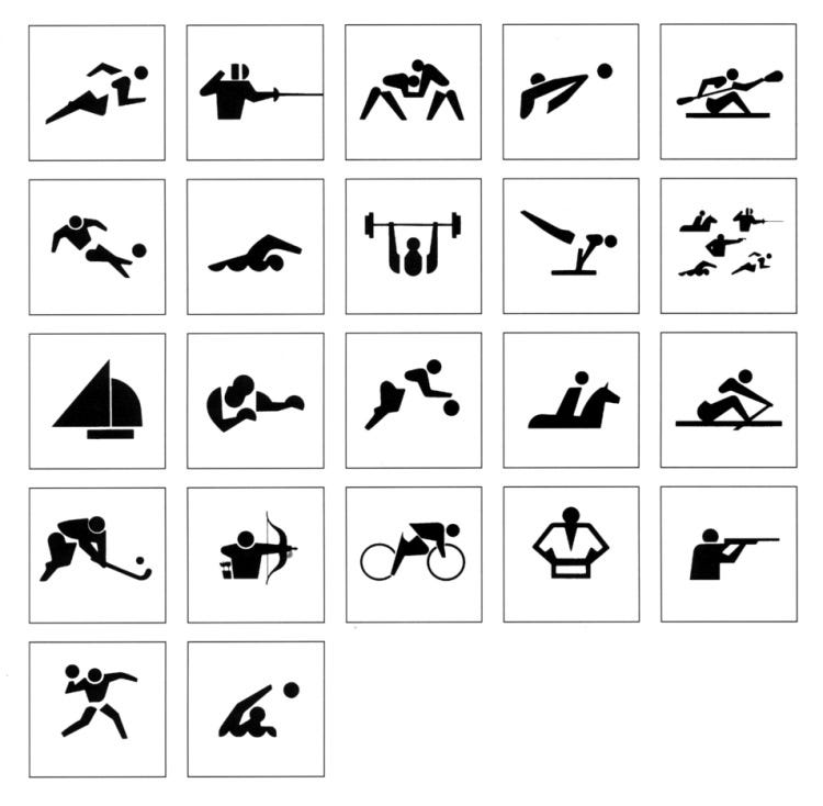
Pictograms for the games made their appearance in the 1964 Tokyo Olympics. As many attendees did not speak or read Japanese, pictograms were used to guide audiences and athletes to venues without relying on typography. They were beautifully designed by Katsumi Masaru and Yoshiro Yamashita. They and their team only had six months to design these minimalist, highly reduced images of the sports we are now are so familiar with. Nineteen pictograms were created for the sports and they were extremely effective in their communication and remain as an example of excellent design today.
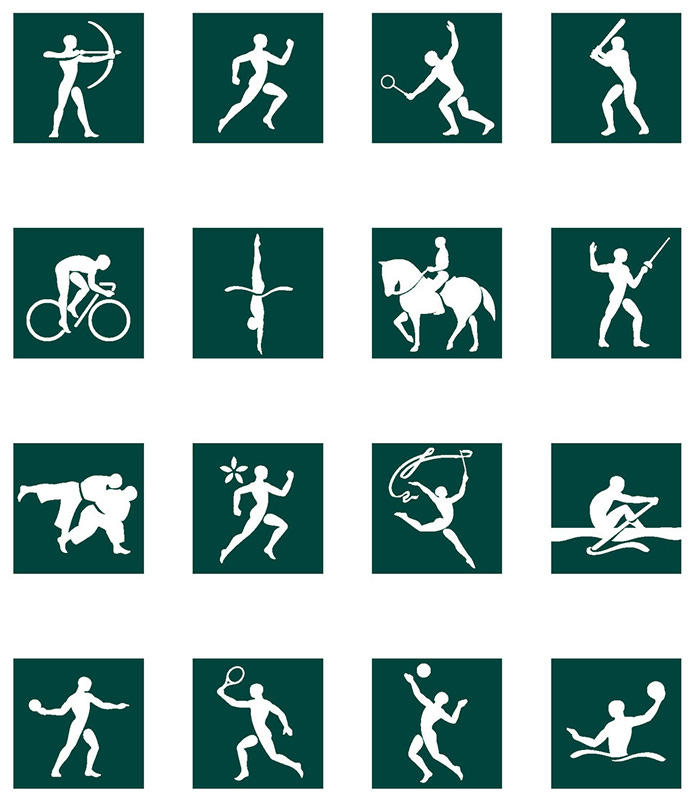
In the coming years, incorporating pictograms became a key part of the look of the games. The Olympics draws in people from all over the world, and creating a system of wayfinding for people that spoke different languages and came from different cultures just made sense. Some other beautifully designed systems include:
The 1972 Games in Munich:
The 1968 Games in Mexico City:
The 1996 Games in Atlanta:
At the last summer 2021 Olympics in Tokyo, designer Masaaki Hiromura introduced a reimagined version of the original pictograms from the 1964 games, animating them with gorgeous precision, a move that spoke to our digital era and desire for video. They were so well done that they became a core part of the Opening Ceremony.
With such high stakes though, comes the opportunity for big failures. We began seeing more and more design systems that incorporated the heritage and culture of the host city, which sometimes worked, but frequently reduced the legibility of the pictograms. We have a fine example from the 2000 Sydney Olympic Games. They really, really wanted that boomerang to work.
Now, you will notice a common thread — almost all of these pictograms feature the athlete performing their sport. The human form can communicate so much information so quickly, and the poses and shapes these figures create make it very easy to understand which sport is being referenced.
One notable exception are the 1968 Mexico City Games, which focuses more on the tools or elements surrounding the sport. This still worked well due to the simplicity of the icons — a ball over a net was volleyball, while one over water was water polo. Now, as a reminder, only 18 sports needed to be represented at these games. The Paris Olympics presented a new challenge, now needing 62 unique symbols to represent the sports in both the Olympics and Paralympics.
It’s a very tall challenge and it’s important to remember the numerous committees that the Paris Olympics design team had to receive approval from. I always say that there should be awards for clients who are willing to take a risk and do cool things, and kudos should be awards to those involved for wanting to innovate.
The newly unveiled pictograms illustrate each of the Olympic and Paralympic sports in a unique coat of arms, paying homage to the complexity of each of these sports and what makes them original. Each of the 62 Paris 2024 pictograms is a rallying cry and a symbol, a standard that will ignite fans’ pride during the world’s largest sporting event.
The head designer of these games, Joachim Roncin, wanted to revolutionize the traditional pictogram system. These coat of arms style images contain three elements:
Apparatus routinely worn or used by an athlete in the respective sport
A playing surface on which the sport is staged
An axis of symmetry fixed diagonally, which may be depicted physically or suggested by the arrangement of other elements
Are they beautiful? Sure! But let’s do a little comparison. These are all pictograms depicting the gymnastics sport from present and past games.
The problem becomes immediately evident. As you scan over these, you realize that it’s not actually very clear what sport the the Paris version is trying to show. And I imagine if you scan over all of the pictograms and compare the Paris versions to ones from the past, you’ll have a much harder time distinguishing the sports.
And that’s a problem, because while pictograms can be beautiful, they need to be functional above all else. Though we live in a world of smart phones and Google translate, we have to remember that good design is all about making information as easily as accessible as possible. It’s still going to be preferable to not whip out your smartphone to understand something. Somewhere between 2.3 and 3.1 million visitors are expected to attend these games, and having these pictograms as a core part of the wayfinding system may unfortunately only result in confusion.
I am truly enjoying many of the other elements surrounding these games, and time will tell if these pictograms really were revolutionary. But, I fear that the designer in turning his back to the required functionality of these iconic images, missed an opportunity to create a system that blended both the art deco elements we see throughout the rest of the identity and while still achieving the most important part of these pictograms: communication.
Sedona series
Not to make this little newsletter too long, but I wanted to give you a behind the scenes look of some of the images I’m planning on referencing in an upcoming series of paintings focused on my trip to Sedona in March of this year. I’m really excited to get started on these pieces, and I hope that will be the case soon!
In the meantime, I’m working on getting some prints made of a few of my paintings. Which one would you like to get a print of first?
Recommendations
Listening to: Today Explained: How Spotify Picks its Winners (big yikes…and it’s a Spotify link of course)
Watching: James Potter’s Channel (lovely watercolor painter)
Playing: Balatro, a poker-based video game


